I usually work on general relativity and cosmology. I have always loved geometrical things. As a kid I was fascinated by map projections. When I was 14, I made a painted globe of Mars based on a flat Mercator Mars map by the astronomer E. M. Antoniadi. Since becoming an emeritus professor at Princeton, I have fondly returned to some of my childhood interests.
I and my colleagues Dave Goldberg and Bob Vanderbei (who invented the “Purple America” map for showing election results) have produced what we believe to be the most accurate flat map of the Earth ever made. Depicting the curved surface of the Earth on a flat map has been the cartographers’ problem for centuries. No flat map of the Earth can be perfect. But flat maps are easy to store and manufacture and are therefore desirable.
Previously, Goldberg and I identified six critical error types a flat map can have: local shapes, areas, distances, flexion (bending), skewness (lopsidedness) and boundary cuts. These are illustrated by the famous Mercator projection, the base template for Google maps. It has perfect local shapes but is bad at depicting areas. Greenland appears as large as South America even though it covers only one seventh the area on the globe.
On supporting science journalism
If you're enjoying this article, consider supporting our award-winning journalism by subscribing. By purchasing a subscription you are helping to ensure the future of impactful stories about the discoveries and ideas shaping our world today.
One can’t make everything perfect. The Mercator map has a boundary cut error: one makes a cut of 180 degrees along the meridian of the international date line from pole to pole and unrolls the Earth’s surface, thus putting Hawaii on the far-left side of the map and Japan on the far-right side of the map creating an additional distance error in the process. A pilot flying a great circle route straight from New York to Tokyo passes over northern Alaska. His route looks bent on a Mercator map—a flexion error. North America is lopsided to the north: Canada is bigger than it should be, and Mexico is too small. All these errors are important. Ignoring one of them can lead you to bad-looking maps no one would prefer.
The object here is to find map projections that minimize the sum of the squares of the errors—a technique that dates back to the mathematician Carl Friedrich Gauss. The Goldberg-Gott error score (sum of squares of the six normalized individual error terms) for the Mercator projection is 8.296. The lower the score, the smaller the errors and the better the map. A globe of the Earth would have an error score of 0.0. We found that the best previously known flat map projection for the globe is the Winkel tripel used by the National Geographic Society, with an error score of 4.563. It has straight pole lines top and bottom with bulging left and right margins marking its 180 degree boundary cut in the middle of the Pacific.
We seem to be reaching a limit on improving the Winkel tripel. When that occurs in science, one often needs a breakthrough, some out-of-the-box thinking, to make any radical progress. Richard Feynman once said that in physics when we are stuck, when all the old methods don’t work, then the new trick, the new method that is going to work, is going to look very different from anything we have seen before.
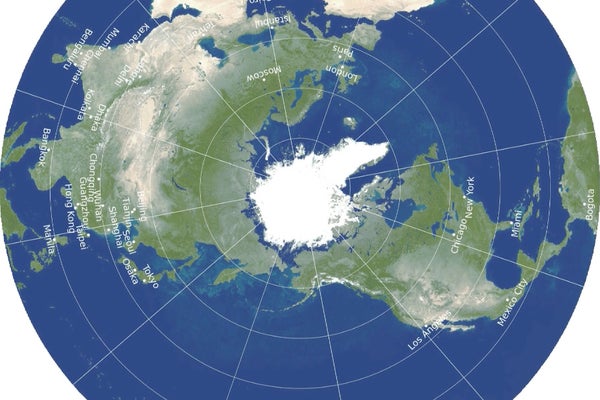
The idea for the new map projection came from a recent paper I wrote, “Envelope Polyhedra,” introducing new class of regular polyhedra in which polygons are allowed to appear back-to-back. I realized I could make a back-to-back circular map: like an old-fashioned phonograph record. One side of the map shows the Northern Hemisphere, the other side shows the Southern Hemisphere, with the equator running around the edge. It has no boundary cuts and the correct topology of a sphere. One simply “squashes” the sphere flat.
We then had to find the best formula for plotting the features on each side, one that would minimize the Goldberg-Gott error score. The answer is one in which the North Pole appears at the center of the north side of the phonograph record, with longitude lines spreading out equally from it where the scale on each longitude line is uniform, and similarly for the south side. Distances between cities are measured by simply stretching a string between them; if they are in opposite hemispheres, the string simply stretches across the equator at the edge of the map.
A disadvantage of the new map is that you can’t see all of the Earth’s surface at once, but remember this is true for the globe as well. Our map is actually more like the globe in this respect than other flat maps. To see all of the globe, you have to rotate it; to see all of the new map, you simply have to flip it over, as you can see below
This double-sided map has a Goldberg-Gott error score of only 0.881 versus 4.563 for the Winkel tripel. It beats the Winkel tripel in each of the six error terms! It has zero boundary cut error since continents and oceans are continuous over the circular edge. It has a remarkable property no single-sided flat map possesses: distance errors between pairs of points (such as cities) are bounded, being off by only at most plus or minus 22.2 percent. In the Mercator and Winkel tripel projections, distance errors blow up as one approaches the poles and boundary cuts.
Our maps can be cut out of, or inserted loose-leaf into, a magazine. They can be made of cardboard, or plastic. A thin box could hold flat double-sided maps of all the major objects in the solar system, or a stack of Earth maps giving physical and political data.
The Winkle tripel is a map to hang on your wall. Ours is a more accurate one you can hold in your hand.
This is an opinion and analysis article.