
While I’m working on working on some cleaned and polished versions of the previous character design style I posted, I thought that I would share characters based on a very different design style for today. For this set of character designs, I was greatly inspired by UPA style cartoons, a prevalent animation design style of the 40s,50s and 60s. This design style focuses on highly stylized characters based off of clean,clear-cut shapes and a very basic use of color. Here are some examples to show what I am referring to:


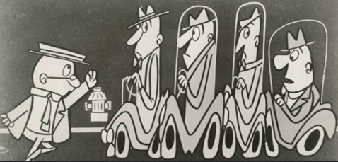
While this art style was used for cartoons, it is most memorable for the way it was used for commercials and advertising. When I was researching a bit about this style, I thought that it might be interesting to see if my parents remembered this style at all. I decided to ask my parents a bit about it-I figured that since my dad grew up in the 50s and since my mom grew up in the 60s, that they might recognize some of the graphic styles from when they were kids. Sure enough, when I showed them what I was talking about, they instantly remembered and clicked with the art style that had been so popular back in the day. It was amazing to just see how their faces lit up as they remembered the particular cartoons and commercials that that had seen as kids.
It’s amazing, to think that art has that tremendous power to connect us with the days gone by. Maybe this sounds silly, but I strongly feel that part of the true beauty of art lies in its ability to link people together and to link them back to their past, while inspiring them toward the future.
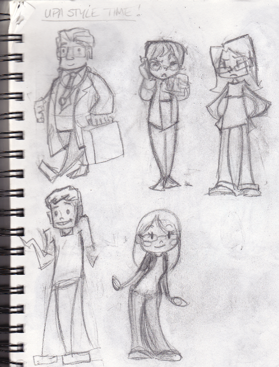
While I couldn’t replicate the UPA style exactly, I did manage to take quite a few of the proverbial leaves from that style book. I took certain elements from that style and I made my own interpretation of it. I’ve been working on designing series of characters based off of people in my life, so I started by making caricatures of my family members. Here’s what I made from sketch to finish!
From this:
To this:
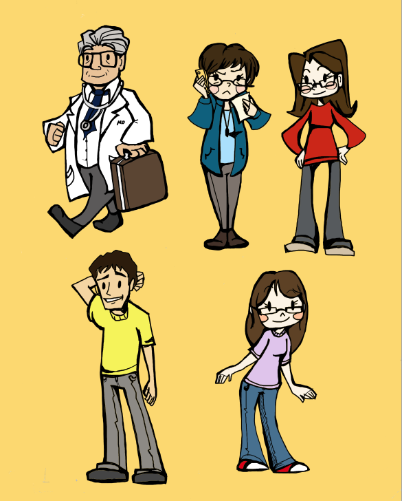
From top left to right: my dad, my mom, and my sister
On the bottom are my brother and myself.
My designs have a bit more shape to them and are a bit more complex than the traditional UPA style. All in all, I’m really happy with how they came out and I do feel like I was able to borrow from the visual vocabulary of UPA while keeping my own touch to it. I showed these designs to my dad and he couldn’t help but smile. He really loved them a lot and he was beaming the whole time just looking at them. Honestly, I think that was what I feel was my true marker of success with these. Just being able to make people smile with what I do, I don’t think that an artist could ask for anything more than that.
I’ve been working on a huge series of these styled characters based off of a lot of good friends of mine from LMU, so I’ll be posting a LOT more of these soon!
