Brand re-invention: Logo is an influential branding instrument
Brand re-invention: Logo is an influential branding instrument
ET Bureau; Delshad Irani & Amit Bapna
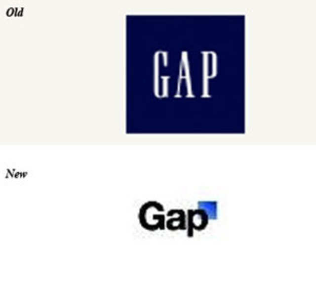
Twenty-ten was meant to be the start of something new for global clothing retailer Gap, which owns brands Banana Republic and Old Navy among others. The company killed its twenty-year-old blue-box logo with the brand name in white type and revealed the new tiny blue-box logo with brand name in black type. Clearly a remarkable transformation! For fans it was all a bit too much to handle.
A few days later Gap had to resurrect the old logo after distressed consumers unleashed their disgust for the new logo on Facebook and Twitter. And just like that, a logo re-invention made headlines across the world, not a first though. PepsiCo's Tropicana re-branding expedition met with a similar fate.
Airtel logo has received a mixed response
Interestingly, it was also around the time the Gap saga was unfolding that telecom major Airtel was readying itself for its new identity. It seemed a particularly inauspicious time to be re-inventing the wheel on brand personality. But the folks at Airtel were unperturbed.
After all, Gap operates in a different environment where consumer involvement is heightened by greater internet penetration and savvy. Nonetheless, it prompted Airtel to carry out intensive tests on the new logo. Weeks in to the new identity, in a gesture of inclusion they introduced the Name Game initiative, a call to the people to provide the new logo with a moniker like Nike's Swoosh and Michelin's Bibendum.
Airtel had to hit the refresh button to reflect the fact that the consumer is changing. "For brands in categories where there is no physical product, the logo takes on an even stronger role. Despite being on the growth trajectory, we had to rebrand to signal the fact the consumer is younger and inject freshness into the brand," says Mohit Beotra, head, brand & media, Airtel.
The logo, however, has received a mixed response. Its colour (red, a favourite and not only in the telecommunications space) and a symbol some reckon too close to Videocon's rebranded logo, the green V, prompts one design specialist to call it a lost opportunity.
Brand and logo re-inventions don't come cheap
Brand and logo re-inventions don't come cheap. Naturally, re-branding has its perils but add a global online population the size of China's on stand by to firebomb and it's bound to send a quiver down the spine of the most seasoned marketer.
Despite the determination to be unique and easily identifiable in an ocean of brands, many companies, old and new, have tweaked their logos through the years. The logo being what it is, the face of the company is usually the first to go under the design surgeon's knife.
Some use a scalpel, others a butcher's cleaver. As you can imagine the end-result on the two op-tables are poles apart. In 2009, Godrej filled its logo with colours to convey the vibrancy and the forward-thinking philosophy of the brand.
Tanya Dubash, executive director and president (marketing), Godrej Industries says, "500 million people use Godrej brands daily in various forms, so for sure we did not want to totally do away with the existing logo, which is more than 110 years old and is familiar to so many." The iconic Apple logo didn't always have bite. The first logo depicted Sir Isaac Newton under an apple tree.
The reasons for a change are plenty
The reasons for a change are plenty - a need to inject vitality and youthfulness in to the brand (the colour in the Godrej logo) and make it contemporary and more importantly connectable (Cafृ Coffee Day's dialogue box logo); diversification and brand extensions (Starbucks removed the word coffee from its logo), expansions into new geographies (Airtel, Mahindra & Mahindra), ventures in to new businesses (Videocon) and in some cases re-branding happens when companies' have been naughty.
Whatever the reason may be, according to Kumar Ramanathan, CMO, Vodafone Essar, it's critical that it should not be a functional calling but an organisation calling. "All constituencies must own it," says Ramanathan, who has witnessed the telecom firm go from Orange to Hutch to Vodafone. Any big change will be seen as a cosmetic one even by the most evolved consumer. It takes a while for its value to trickle down. "But that's alright," says Ramanathan, "the residual value is measured over time,"
Some companies change the logo when they ought to change the strategy and then revise the look of the logo, says Scott Goodson, founder & chairman, strawberryfrog; "You need to clarify and define the brand and the cultural movement strategy for the brand in order to transform a business." Failures happen when the only change that the audience sees is a new logo.

Failed rebrands occur when not enough time has been spent on planning the change
According to Young Kim, creative director, Siegel+Gale, a strategic branding firm that has worked on brands like Dell, American Express, Motorola and Microsoft among others, failed rebrands occur when not enough time has been spent on planning and communicating the reason for the change, both internally and externally. It has to be strategic. Says Kim, "Re-branding is not just about changing a logo."
But sometimes a logo change is just that. Viren Razdan, MD, Interbrand, the design firm which handled Godrej's logo redesign, says "Very often companies use a rebranding exercise as a catalyst to refresh their manifesto, recharge their employees and boost trade sentiments." All logo change does not necessitate discarding everything from the past; according to Ashwini Deshpande, director - Elephant Strategy + Design, they only change to align themselves with the aesthetic trends.
"They do not necessarily change or realign their values or DNA," says Deshpande. It really depends on the lifecycle of a product or service.
However, just avoid the temporary high trap. Razdan says, "Such initiatives unless supported by deeper intent which has to be long-term impact on product, promise and experience — would come through as superficial changes which do not have any enduring values."
Make brand identity systems more flexible
Landor Associates' Lulu Raghavan, fears Indian companies see the logo as a quick fix. "They want to be more contemporary, cooler and youthful. But I'm not sure how many have gone through real transformation to change the culture and align the organisation to support what the logo is meant to convey."
Thoughtful union of corporate and aesthetic strategy or pure humbug? We'll let the consumer decide. After all, perhaps more telling than these individual decisions made in the confines of a brand's headquarters be it Atlanta or Noida, is the deepening gorge of the consumer's interest in the manner in which a company chooses to express itself through its aesthetic strategy.
According to Nitin Mathur, senior director, marketing, Yahoo! India, (in 2009 Yahoo became Yahoo! in a massive global rebranding push) the key is to make brand identity systems more flexible. "Can consumers play with your logo?" Well before Airtel launched the 'Name Game' that got approximately 150,000 entries, Tata Docomo had an animation contest that allowed users to play around with the logo and the winning entries appeared on the telly.
"The game of defining values is going to be so dynamic due to this participatory brand building, that all conventional rules will have to be re-written," says Deshpande of Elephant Strategy + Design. The logo is indeed an influential branding instrument and can turn on a range of human emotions. But a logo change is certainly no more a private affair, and if one doesn't get it right, punishment will show up in your front yard, in 140 characters or more.